One of my favorite types of knitting is stranded knitting using two or more colors. Fair Isle is the best, where only two colors are used at a time on any one row. When more than two are used in a row, it is not technically Fair Isle. It’s more difficult to manage three strands of yarn also. I avoid that, but using two colors, one in each hand, is quite fun.
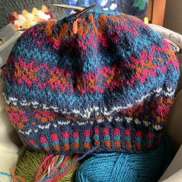
I’ve seen a lot of knitters complain that they are not good at choosing colors for this type of knitting. When five or more colors are needed in a project, like the hat below, combining the perfect colors can be daunting. It is tough to envision them blending throughout the work. But, there are ways to choose colors that will work.
First I Choose a Background, or Main Color Yarn
I enjoy picking out the colors for a colorwork project myself. By day, I do design work for my job and create graphic designs which have to do a lot with color matching. Maybe this is why I enjoy choosing my own yarn colors for projects.
My tip is to find the base, or background color first. I could change it later, but finding the base color gives me something to work from. Usually it will be something neutral which goes with a lot of colors, such as white, tan, gray, or black. Basically any color that you will NOT be using in the design and makes a good contrast for the remaining yarn.
Decide on a Bright or Muted Combination
Before knitting, get a good idea of how the end product should appear. Do you want it to match a coat or sweater you own? Will it be brightly colored, or have muted colors to match everything? Is the design something that should pop, or blend? And most important is to choose colors you will love to wear.
For the first Katie’s Kep hat I knit I decided on dark blue as the background color. From there I decided that I wanted brighter colors which would stand out a bit. Even though I messed up on the pattern (a little) overall I am happy with the colors.
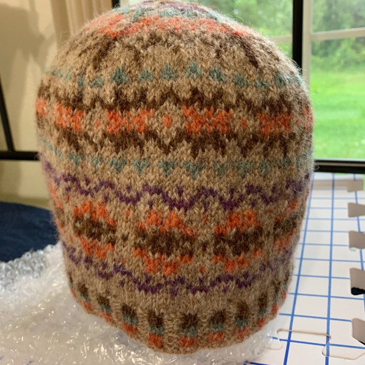
When I knit my second Katie’s Kep, I chose tan as my base color and I wanted a more muted overall design with earthy tones. The colors I chose were not bright, but were meant to blend nicely. See both hats in the slide show below.
Choose Which Design Elements Should Stand Out
In the Keps I knit, the important design elements were the floral sections. After deciding on tan for the base, next I thought about flower color. The orange was perfect. Once the larger parts of the pattern were chosen, I needed colors for the smaller rows which separate the floral images.
For the tan Kep, I chose colors that are not “true” and have somewhat of a “gray” tone to them. For instance, in place of a real blue I would choose a gray-blue and in place of orange I would choose a rust orange. When adding row that will contrast a bit more, I chose something totally different like dark purple. Fortunately a lot of nice wool yarn, like Rauma, J&S, and Shetland is dyed in these neutral colors to make it easier to combine them.
Then there is always the copy option. The designers themselves are usually quite good at choosing colors. Here is where it is okay to copy someone online…!! Knitwear designers will usually list their yarn and colors used which takes all the guesswork out. For instance, when I knit Katie’s Kep, there were four different yarn color combinations included in the FREE pattern. I did not use them, because I like to come up with my own. But for anyone needing that help, it was right there to use.
Knitting Books That Help With Colorwork
If you like the idea of DIY, begin learning by simply studying Fair Isle colorwork knits you find online. Or buy books that have Fair Isle patterns and color selection ideas. I have Alice Starmore’s Book of Fair Isle Knitting (affiliate link to Amazon) and wow, is it ever full of inspiration! Mostly it’s over my head at this point, but I love to skim through and see the beautiful colorwork designs. It’s a fabulous book for any knitter’s library.
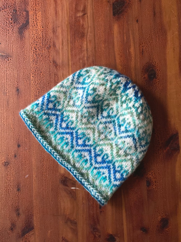
I also have A Shetlander’s Fair Isle Graph Book and began knitting a hat using the “green diamond” design shown on this page. It turned out that my yarn stash included colors that closely matched the colors in the book!
And Then There’s Black and White
Just as easy, is the option to buy a kit to knit a stranded colorwork project. The yarn colors are pre-selected for you and you pay for everything at once and are ready to knit. A lot of times yarn stores will create kits for popular patterns.
Last but not least. Have you ever heard to turn your yarn image into black and white to check the contrasts? If you are wondering how that works, check out this blog post that explains it.
The Katie’s Kep is meant to use five colors, but that is up to the knitter really. Colorwork patterns are perfect for using up scrap bits of wool.
Get the Katie’s Kep free hat pattern here. Join the multitude of knitters who have already knit this wonderful pattern.
Yarn Color Combination Inspiration
Find some great ideas to inspire your newfound confidence in combining yarn colors at the places listed below.
- Wirsit Inspo / J&S Blog – yarn color is matched up with photography on this beautiful page.
Knitwear Designers Who Create Stranded / Fair Isle Patterns
Are you a Fair Isle designer? Let me know and I’ll add your link here.
- Mary Ann Stephens
- Wilma Malcolmson
- Ysolda
- Helen Gray Designs (Ravelry link)
A Few of My Previous Colorwork Projects
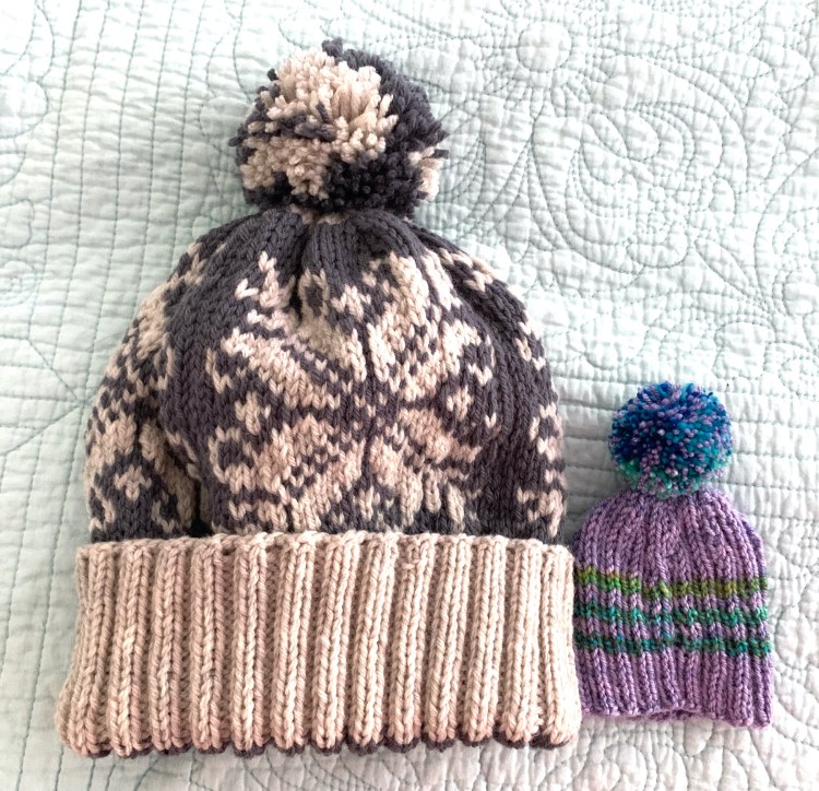
Clicking the title beneath the photo will take you to the project blog post page. I don’t have a link for the light blue hat, but it’s the Fana Cap pattern which is in the “Hat’s On!” book.


